
I’ve been working on frontend applications recently, and one question haunts me more than unhandled exceptions: “How do I center content in a div?” If you’re a backend developer like me, CSS can feel like dark magic, full of rituals and incantations nobody fully understands.
But since I’ve spent a considerable amount of time Googling this, I’ve decided to document it. Trust me, it’ll save you from asking your frontend colleagues… again.
Display Flex
Before we talk about centering, let’s set the stage with display. CSS has a few ways of structuring elements, but the most powerful one (especially for centering) is display: flex.
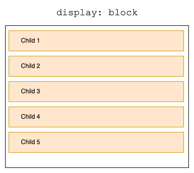
Display Block vs. Flex
display: block: Your element behaves like a grumpy rectangle. It stretches across the entire width of its container and stacks elements vertically. Great for paragraphs, not so much for centering.display: flex: The cool kid on the block. It allows you to arrange child elements horizontally or vertically with ease.
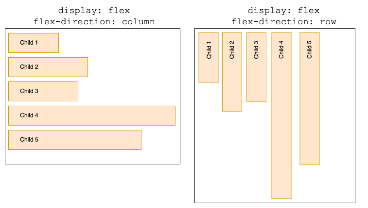
Flex-direction
By default, flex-direction is set to row, which arranges items in a horizontal line. If you want vertical alignment, you can set flex-direction: column. Think of it like swapping rows and columns in a database table.
.container {
    display: flex;
    flex-direction: column; /* Or "row" */
}
With this simple setup, your container is ready to flex.
Justify-Content and Align-Items
These are the properties that actually control the alignment.
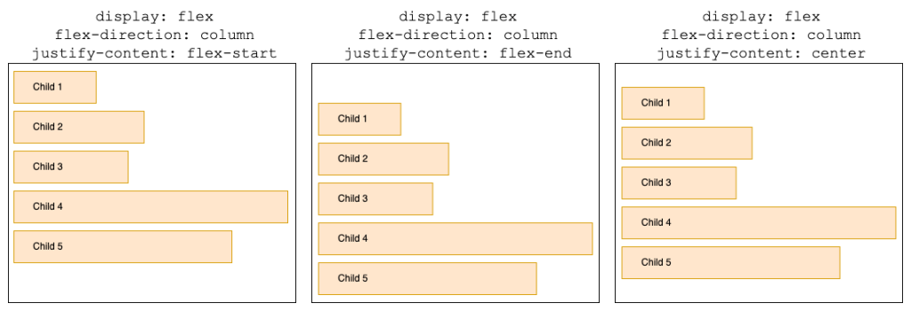
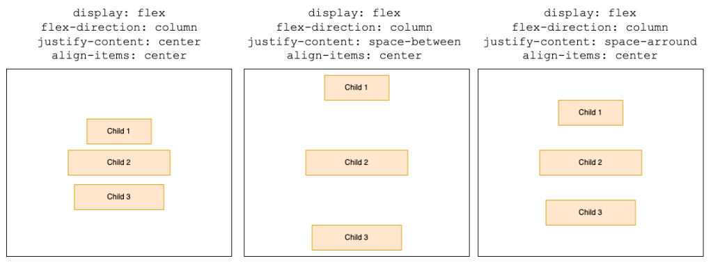
Justify-Content
This property aligns items along the main axis (horizontal if flex-direction: row, vertical if flex-direction: column). Options include:
flex-start: Elements huddle at the beginning.flex-end: Elements run to the end.center: Centers all items in the container. Finally, some order in this chaotic world.
.container {
    display: flex;
    justify-content: center; /* flex-start | flex-end */
}
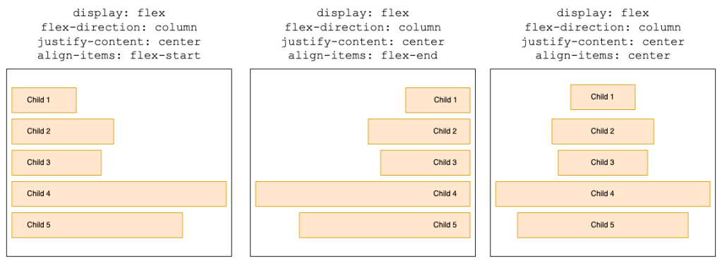
Align-Items
This one handles alignment along the cross axis (perpendicular to the main axis). Think vertical alignment when flex-direction: row.
flex-start: Sticks items to the top.flex-end: Glues items to the bottom.center: Suspends items in the middle, defying gravity.
.container {
    display: flex;
    align-items: center; /* flex-start | flex-end */
}
For perfect centering in both directions, combine these two:
.container {
    display: flex;
    justify-content: center;
    align-items: center;
}
Aligning Multiple Items
What if you have more than one child in the container? Enter space-between, space-around, and gap.
Space-Between and Space-Around
These properties distribute space around multiple items in different ways:
space-between: Puts equal space between items. Zero space at the edges.space-around: Adds equal space around items, so edges get half the space.
.container {
    display: flex;
    justify-content: space-around; /* Or "space-between" */
}
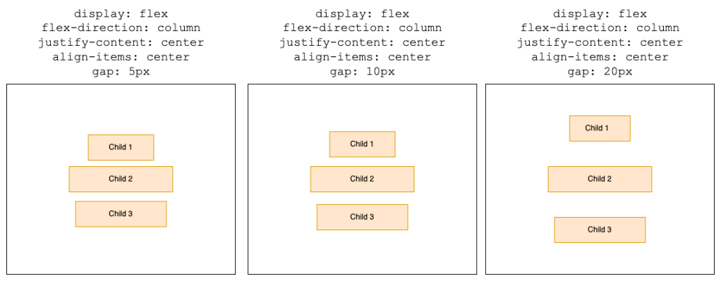
The Gap Property
The gap property is the cherry on top. It defines consistent spacing between items—no need to add weird margins to individual elements.
.container {
    display: flex;
    gap: 20px;
}
Conclusion
As a backend developer, I’m the first to admit that CSS can feel like a whole different programming paradigm. But understanding these little tricks makes life a lot easier. Plus, it saves you from hearing, “Oh, that’s easy! Just use Flexbox,” for the 500th time.
The next time you need to center something, you’ll have the tools (and maybe even the confidence) to do it yourself. And if all else fails? Add more divs. That’s what the pros do anyway.
 The Dev World - Sergio Lema
Leave a comment